Case Study
The WITS Programs Foundation is a non-profit organization that has developed programs for children from Kindergarten to Grade 6 to help navigate and manage bullying, discrimination, and peer victimization while learning about the importance of promoting kindness. The WITS group of programs unites schools, families, and community organizations in the interest of spreading kindness and teaching kids how to manage conflict.

The Challenge
The WITS Programs Foundation had a dated WordPress website with an online store that had been serving them well and was easy for their team to manage. However, the organization’s strategic move to a subscription model for accessing their resources and training programs could not be supported on their existing site and so the time had come to invest in an upgrade that would support this new direction. It was time for a refresh.
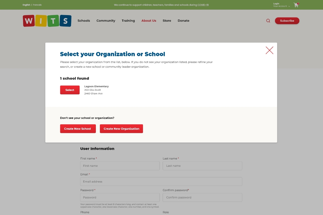
The new model required different membership options for Schools vs. Community Organizations, the ability for staff and educators to create user accounts under their parent organizations, as well as a protected members-only area of the site where the courses and resources could be accessed once a subscription had been purchased in the online store. The website would also need to integrate with the WITS CRM to manage new memberships and allow existing organizations the ability to look up their organizations when registering on the site. A learning management system also needed to be integrated into the online courses. Finally, the website needed to be available in both English and French!
The Solution
The first step was to document the functional requirements for the new subscription model. The team at Caorda worked with WITS to determine details about user roles, subscription types and expiration dates, and purchase rules. Ultimately it was decided that this new system would require custom WordPress development to allow for the tiered membership system and CRM integration that the WITS team required. Caorda’s highly skilled development team took the challenge head-on and built a custom solution that was tailored to the WITS team’s needs.
Since the website needed to be available in both English and French, Caorda implemented a multi-site WordPress solution. Instead of creating one site, Caorda set up an English and French site separately to avoid using a translation plugin, which can slow sites down. Creating two separate websites also enabled WITS to provide professionally-translated content for French-speaking subscribers, since translation plugins can often miss the mark.
The multi-site model solved a lot of problems, except one: since the WITS site needed to contain an online store, how would this fit into the puzzle? Our go-to WordPress plugin for eCommerce is WooCommerce, but installing this plugin on both the English and French sites individually would mean that the team at WITS would have to manage two separate inventory systems and two different order dashboards. To avoid this mess, we ultimately determined that the multi-site model would require not two, but three sites: one for English content, one for French content, and one for the online store. This solution made it possible to keep order and inventory management simple, especially considering new member subscriptions are purchased through the online store!
Over 370 historical URLs were transitioned to new pages in the newly developed website. If this isn’t completed, all WITS’ URLs would break in Google and send people to 404 Not Found pages.
The Transition
An important component of any website redesign project is a carefully executed SEO-transition plan to ensure that search rankings are not lost due to changing URLs, broken links, or 404s. This process can be painstaking, with page content from the old and new sites being assessed to determine the best possible page to direct old indexed links to. In this case, a particular challenge arose due to the new access permissions and protected sections of the site. Since so much of the new site would now be for subscribers only, this meant a particularly detailed plan was required to ensure that old indexed pages would not end up on broken or dead-end pages. This was a highly detailed process with each link needing to be reviewed and possibly redirected to a new related page on the website.
Our professional SEO experts also had the experience to pick up on a wide range of behind-the-scenes improvements. The Caorda marketing team worked with our developers on a range of updates that are essential for websites that need additional performance to engage well with mobile audiences. There were over two megabytes in just images alone on the old homepage, but thanks to modern formats like SVG and WebP, the new homepage uses just 990KB of total data when viewed on mobile phones.
Custom WordPress Development
While WordPress plugins and standard features can save time and make website development easier, sometimes the best solution is one that is a custom WordPress website just for you. As the WITS Programs Foundation expands its reach to help educators and community leaders from coast to coast and beyond, it is likely their requirements for the site will change in the future in conjunction with new operational demands. Since their site has been custom-built with a subscription model specialized to them, it will be easy for new functionality to be added when the need arises. Caorda is proud to have supported an organization that does such fantastic work, and looks forward to working with the WITS Programs Foundations in the future!
Fresh Design
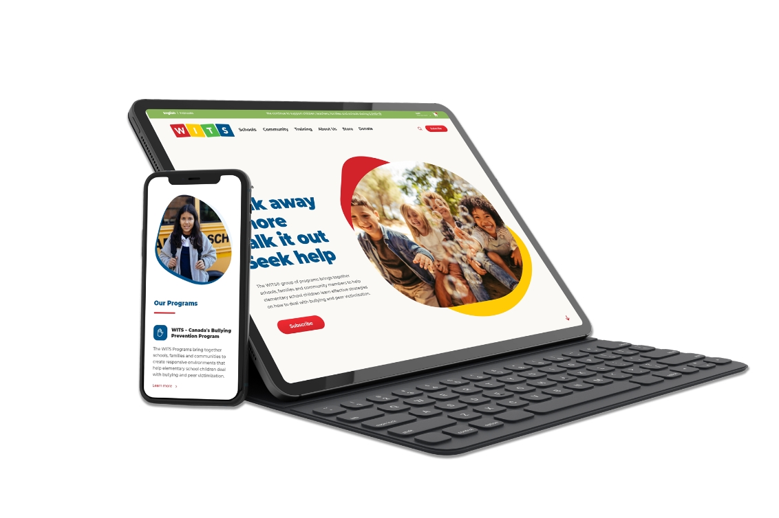
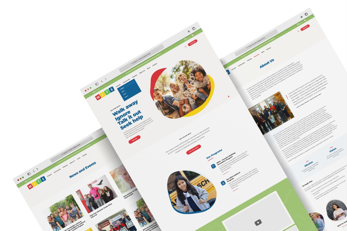
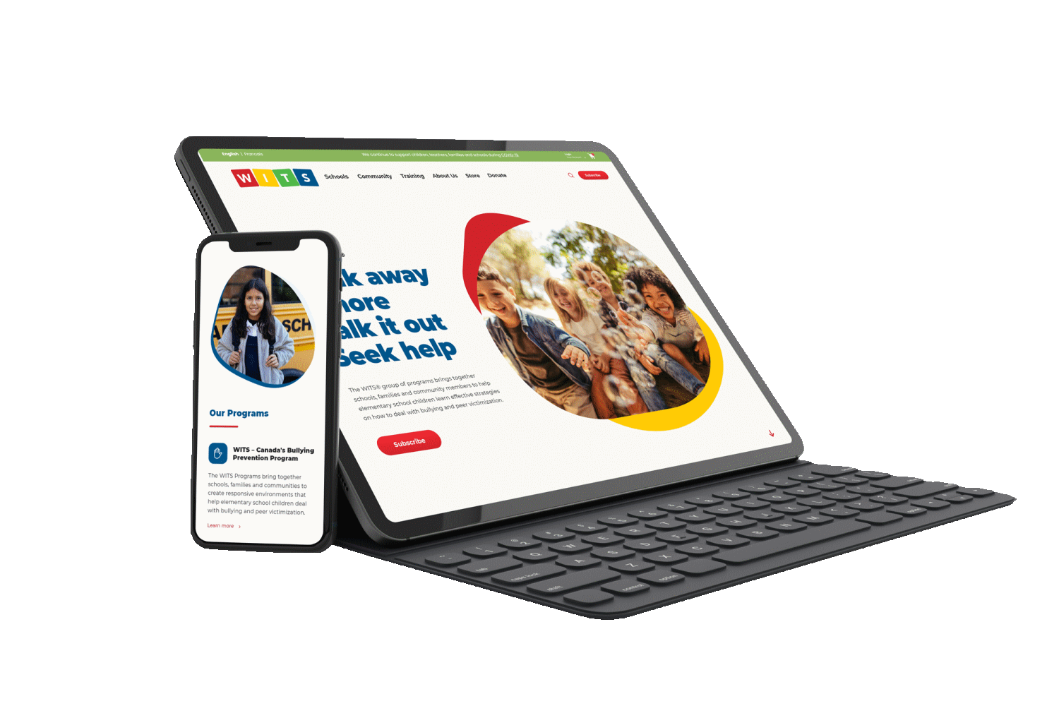
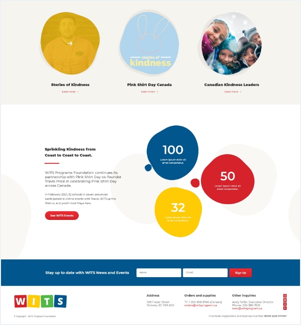
The new website was not only overdue for a makeover when it came to the site’s capabilities, but was also desperately in need of a design and user experience (UX) refresh. Using the WITS brand colours, Caorda’s design team created a bright and happy site with fun shapes and interesting lines to evoke a sense of childhood creativity and play. Each call-to-action was carefully considered to ensure the user will have plenty of opportunities to engage with the site and find it simple and easy to navigate.
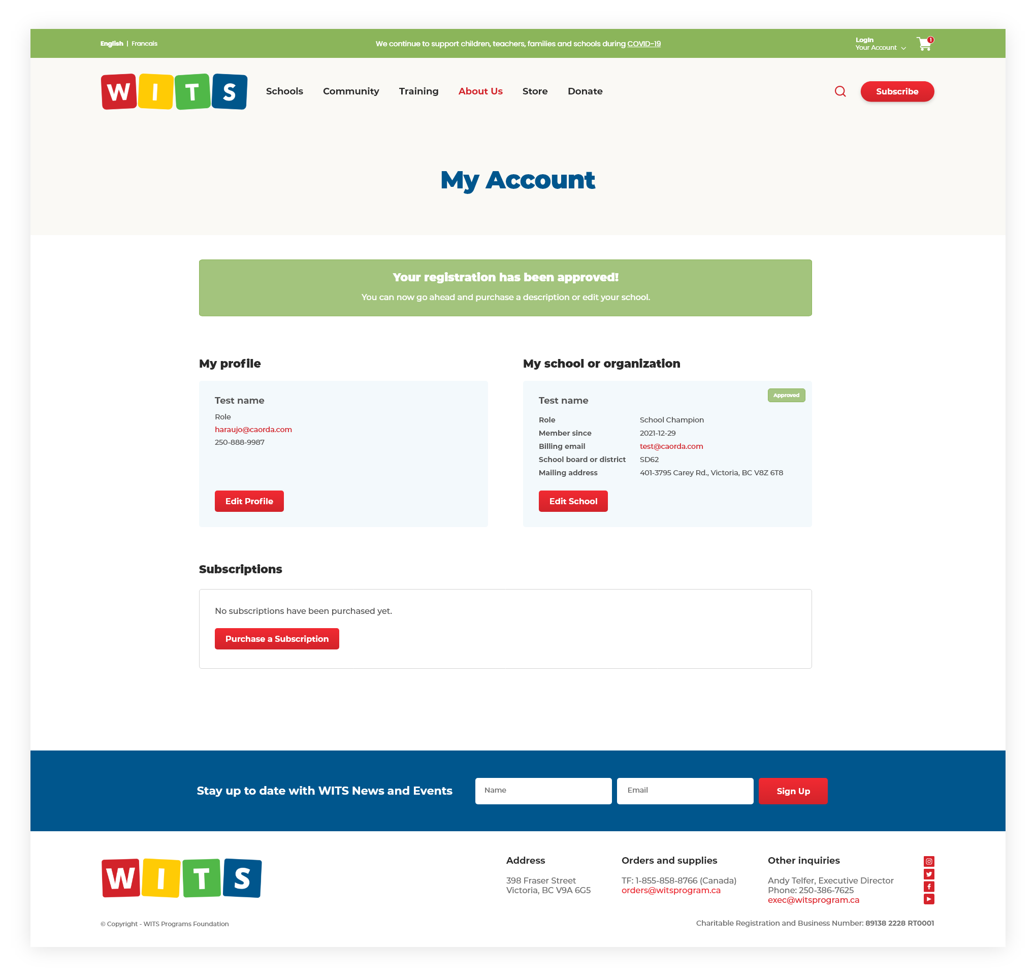
The design also played a significant role in the website’s user experience with each screen, registration form, and account page for the new subscription process requiring special considerations. Caorda worked with WITS to decide the best way for new subscribers to move through the registration process, what prompts and status updates should be shown along the way, and how the user will interact with the site
