Recently the digital marketing team has been inundated with emails from Google about the effect that site speed has on the whole mobile experience. The experience in this case is our visitors’ affinity for leaving your website if it doesn’t completely load within 3 seconds! The numbers of site exits are huge; remember this is from mobile devices.

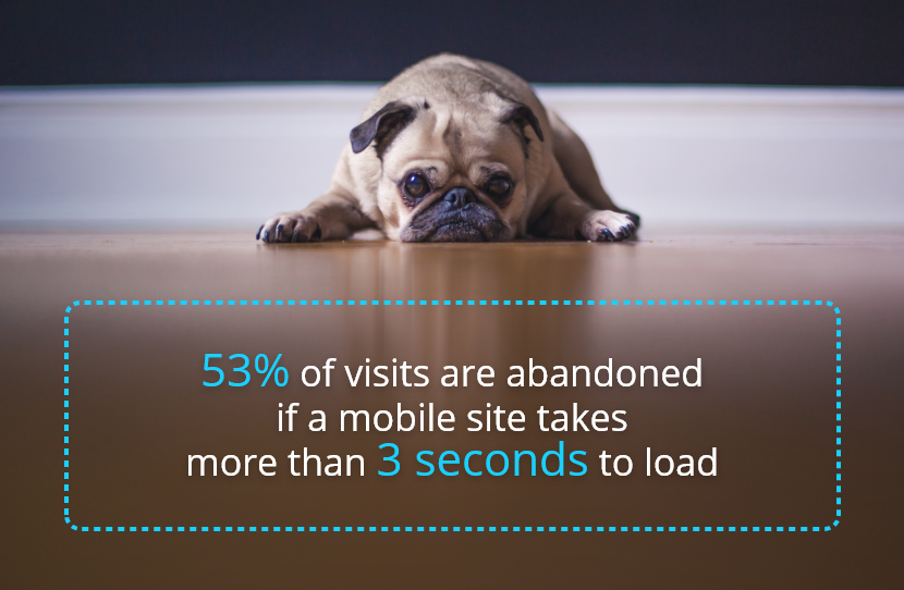
53% of visits to a mobile site are abandoned if it takes more than three seconds to load.
That is not a statistic that we can afford to ignore. We spend so much time staring at our own websites using our desktop computers that we never see ‘the other side’. If half of the people that look at your website are on their phones, it’s pretty darn important that you research what you’re subjecting them to.
Here’s another ridiculous statistic.

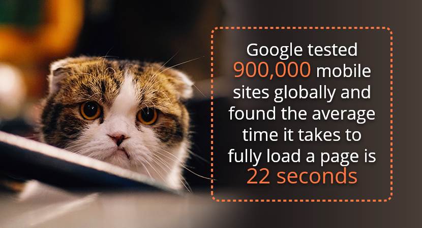
Google tested 900,000 mobile sites globally and found the average time it takes to fully load a page is 22 seconds.
That is literally billions of dollars in lost revenue across all of these websites. It’s great news for all those companies who have a definitive mobile strategy and are exploiting the apathetic approach by most of the internet.
A Slow Website Limits Your Business
I can’t claim that statement as my own, but it’s darn good! It was in a Google email. They have sent us so much ‘gold’ in recent weeks that we can’t help but want to share them with you. Ignoring these stern warnings from the world’s biggest lead source is at a very high cost.
Here’s a simple case study (you might have played with this already if you’re familiar with the Test My Site tool):
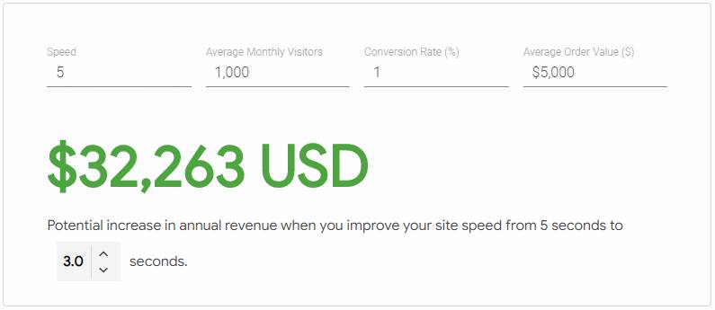
- A website scores at 5 seconds on a 4g network.
- They recieve around 1,000 visitors per month for their website selling Solid Gold Smurfs.
- They convert at around 1%, which could be considered quite high.
- Based on Google’s user data, improving the website speed from 5 seconds to 3 seconds would increase their revenue by over $32,000.

Are you interested in Testing Your Site now?
Get Your Site on the Road to Mobile Awesomeness
Once you pass your website through the tester, Google will offer some very technical suggestions on how to improve the speed. If you can put your web ‘persons’ in front of this test, they might be able to help develop a strategy.
In the meantime there is a very simple way to help guide you in the right direction.
Think and Behave Like Your Customer
Using your phone and a fresh browser. It’s important you do this to remove any saved versions of your website and any personalization if you’re logged in to your Google Account. It’s like you’re visiting your website for the first time as a brand new potential customer.
- On Android, open Chrome and tap the 3 dots in the top right corner and choose “New incognito tab”.
- On iPhone, open Safari, choose a new tab, tap ‘Private’ and ‘Done’.
Once you’ve completed that, visit your website. I know, earth-shattering advice. Really though, try to mimic how you would expect someone to arrive at your website and eventually do something; we usually call this a conversion. Try to do this WITHOUT using the main navigation and solely use your links and buttons that are found on the pages themselves.
Here are a few common areas that will improve a users experience on a mobile phone
Your headings are too big
Websites often just ‘squish down’, this is called being responsive. However, we rarely see websites changing heading sizes to match a more appropriate screen size. We see giant fonts which only serve to push your wonderful content and links further down, out of sight.
There’s too much whitespace
Space around elements can have a positive effect on a desktop for separating horizontal elements and creating prominence for other buttons and ‘Calls to Action’. This doesn’t translate well on mobile where everything ‘stacks’ and you end up with oceans of blank space forcing your visitors to scroll endlessly to reach your critical information.
There’s nothing to do on the first screen
This is very common. Ask yourself, what is the most important page that you want to drive your visitors to? Be sure to link to it directly from your homepage on the first screen (the first screen visible before you have to scroll).
Nobody’s Perfect
No website is ‘perfect’, and our team is constantly researching and learning about what makes websites better for everyone; not just Google.
We really hope that you’ve been able to see the other version of your website in a new way along with moments of clarity. Hopefully there were a few areas where you thought to yourself “I think we can improve that part there, or make that page easier to find”.
We’re pretty good at helping websites perform better, so don’t hesitate to call and have a chat. We’d be happy to help.
