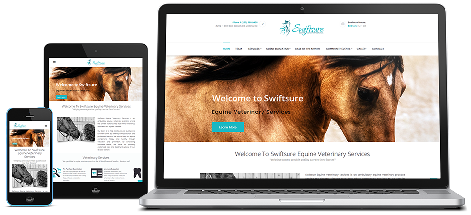
Here are a few pointers to help improve the look of your web site.
Text Guidelines
- Good text vs. background contrast – Light text on a white background is next to impossible to read! Also, it is best to use a lighter background color than text colour because this makes for easier printing and saves on ink. Create a strong contrast between the background colour and text colour.
- Keep fonts easy to read – This is to say, don’t use fonts like ‘handwriting’ or some other obscure, illegible font. Not only does this make your page barely readable, but it also ensures that your page will be viewed the way you want it to as some users will not have certain fonts installed on their computers resulting in a default font.
- Limit the number of fonts you use – This makes your page easy to read, and creates solid continuity and flow through your content. Visually, using many different fonts creates a cluttered and difficult to read page presentation.
Image Guidelines
- Keep image file size small – If your images are too large, your website will take a very long time to load and so visitors will lose patience and leave. Do your visitors a favour and reduce the size and resolution to match the website.
- Be careful of animated GIFs – Animated pictures are distracting when people are trying to view your web page.
- Images should be:
- Relevant
- High Quality
- Not require scrolling
- Watch for broken links or images – Broken images and links are disappointing to viewers of your site – chances are, if they clicked on it, they were interested.
Media Guidelines
- Avoid large media files on the front page – Unless the images are fully optimized, chances are your audience will give up waiting for the page to load, and thus won’t see your web site.
- Be careful of background music – Just don’t. No one likes this. Not ever.
Page Size Guidelines
- Front page shouldn’t require scrolling – The homepage looks best if the user can see it on one screen. (UPDATE) This is a bit antiquated, but the main issue remains; ensure that you have important touch points ‘above the fold’ so that users have somewhere to go right away if they chose not to scroll.
- Stay away from horizontal scrolling – The computer mouse doesn’t have a left-right scroll wheel, making it difficult for the user to view your web site. It would be like having a book whose pages are three feet wide! Imagine having to run back and forth to read your novels.
- Break long pages into several smaller pages – Reading super-long pages is almost as irritating as side-to-side scrolling. Not only that, but it makes finding things on your page very difficult.
Colour Guidelines
- Use conservative colours – Neon pink on violent yellow is not only painful on the eyes, but will also create extreme readability issues.
- Use a sensible, consistent layout and colour scheme – If your web pages are all drastically different from one another, this is both distracting and confusing for the user. Always please the lowest common denominator! Just stick to one layout for your entire web site; this creates unity and…feng shui?
Navigation Guidelines
- No empty pages – These are just as disappointing as broken links, and much more confusing!
- Consistent, clear navigation – Make sure your users can find their way around your web site. One good way to do this is to create a navigation bar that is the same on every page.
- Test it on multiple browsers (and smartphones) – This problem is not your fault, but you’re stuck fixing it. Make sure your web site looks the way you want it to in Firefox, Internet Explorer, Google Chrome, and maybe even Netscape for good measure.
A Few Last Words
- Less is more – It is much more effective to keep content short and sweet – without compromising grammar, of course!
- Check your spelling and grammar – Typos happen to the best of us. Make sure you check your content before putting your web site online. Imagine viewing an English website with tons of speeling mistaks!
- Do not break copyright laws – This is a tricky one. Just make sure that any images you use are either created by you, or free to use. There are many free image databases online for your using pleasure.
