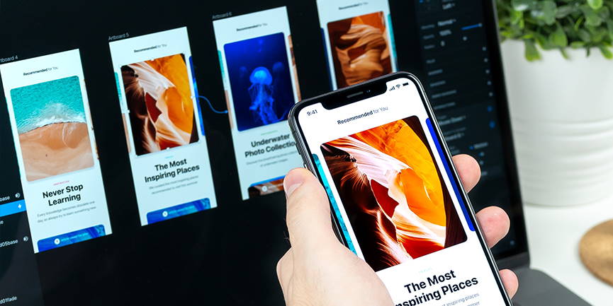
There’s a lot more to website design than meets the eye. From the moment a website project is proposed, to the day it flies out the door, design and marketing determine the direction of the website. This is based on close collaboration with the client’s business goals and the marketing history of the website. Design can be art, but it can also be aesthetics or usability. Whether your designer is creating a digital picture on the screen, strategizing a progression of animations and transitions for page elements, or visualizing the way an interface might look on an iPhone, design is there to help communicate solidity, instill brand trust, and encourage visitors to engage with the website.
Determining Tone and Purpose

There’s a delicate and vital relationship between design, user experience and search engine optimization (SEO). After we work with you to establish an SEO strategy that defines the target customers for your particular business/industry, design does the rest with frequent conversations with digital marketing to ensure that the appropriate engagement points are established. Behind the scenes of successful website design, particular optimization reasons dictate which elements are chosen for any given layout, and how they are placed on the page. It’s all to make the user experience intuitive and organic which builds trust and loyalty—and business! The website design is implemented with these guidelines in mind, and the resulting visual appeal and function will ultimately help lure and retain visitors, which in turn boosts traffic (website visitors)—the ultimate goal for SEO and digital marketing.
Mapping the Course, Developing the Site Architecture

The structural backbone of every website project is its page architecture or navigation. Think of it as a tree, with the home page being the trunk. The largest branches jutting out from the trunk will be your main pages (services, products, about, contact, etc.), and then smaller twigs will extend from each of the main pages to contain specific information on sub-pages (service one, service two, service three, etc.). The sitemap or website architecture outlines the entire navigation structure of the site and not all pages of the sitemap need to be included in the primary navigation. Planning the overall flow of the user experience (UX), and how the topics and pages connect, is an early step essential to the website design & development process.
Content Planning & Design

We work closely with our wonderful clients to determine and organize the appropriate amount of content for the pages of their website. Pinpointing the hierarchy and primary calls to action (CTAs) is crucial before getting too deep into the design phase. Determining the most important pieces of information upfront, and knowing exactly which resources are available to pull from—brand guides, page copy, photography, downloadable resources, and articles—will give your website designer a fighting chance to draw upon as they begin piecing together the aesthetic components of your site. The end goal should ultimately help solidify your company image, and so all visual components should be chosen carefully. More on content design »
“Content precedes design. Design in the absence of content is not design, it’s decoration.”
What are the Design Steps?

We’ve talked a lot about website design in other issues, but here’s some of the nitty-gritty lingo that gets spouted out regularly here at Caorda. These are some of the more common terms concerning the phases of website design.
Wireframe
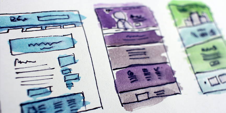
A wireframe (also known as a page schematic or screen blueprint) is a visual guide that represents the skeletal framework of a website and is created to arrange elements to best determine page functionality, behaviour, and priority of content, including interface elements and navigational systems, and how they work together. The wireframe lacks typographic style, colour, or graphics since the main focus lies in functionality, behaviour, and priority of content. Here’s an example of how wireframing works »
Website Mock or Mock-Up
A mock-up is usually one of the first steps in the design process. It is the artwork file (Illustrator, XD, Photoshop, InDesign, etc.) It typically contains placeholder content (such as Lorem Ipsum text and watermarked stock imagery), and might not use the final colour scheme.
Website Comp
A comp (or comprehensive) is typically the final step before the artwork gets sent to development. This will contain no placeholder text or images, and the colour scheme has already been finalized.
Proof of Concept
A proof is a snapshot of the comp or mock, either presented as a downloadable file (PNG, PDF, JPG, etc.) or as a link to an on-screen image or series of images that demonstrate the website design.
Website QA & Testing

Before a completed website is launched, it gets passed back to the designer, who will spend some time examining the working model to make sure it follows the styles signed off on by the client. If anything wasn’t implemented completely, or if minor adjustments are needed to elements that hadn’t existed during the design stage, they are added now. This stage also gives the designer a chance to make sure the website’s styling is consistent across various mobile devices. These days, approximately 50% of your website’s visitors are staring at their phone, not sitting behind a computer screen, and so a good web designer knows how to envision the ways each page element will vary from device to device. Finally, design and digital marketing huddle to ensure that the website is clean, functional and built to do the job that the client expects. And that Google can crawl and understand each and every page in the website.
“Design is thinking made visual.”
Want to learn more about our process? Check out the Website Design & Development Process page on our website. Or just contact us to schedule an in-person or video meeting with one of our awesome project managers!
