Millennium Computer Systems provides a suite of complex and robust web-based software tools for administering higher education institutions (universities, colleges and other types of schools). As a company that works in technology, it’s important that their website accurately reflects their technical competencies.
The Challenge
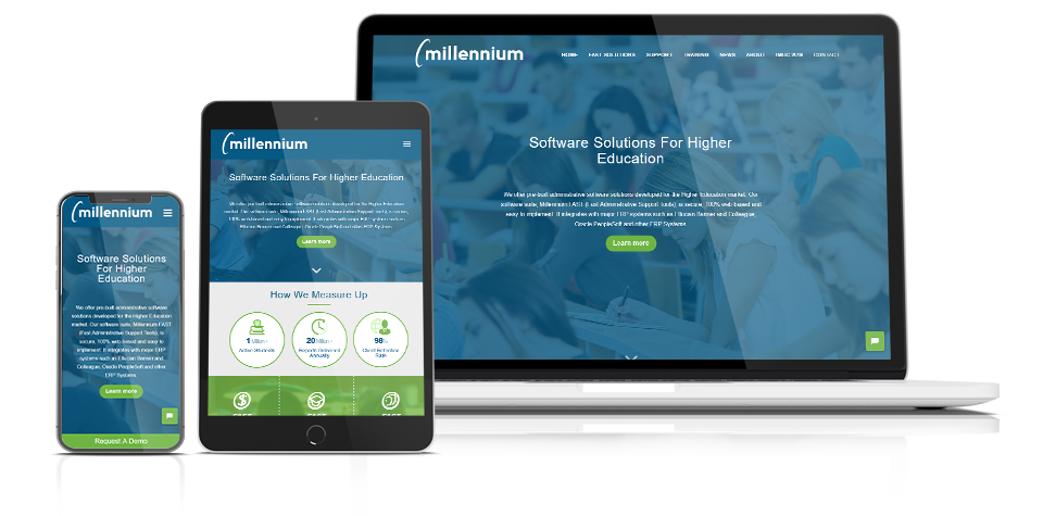
When they approached us, their site was looking dated (built about 10 years ago) and was in need of a refresh to make it look modern. It needed to be more mobile-responsive and required better navigation to easily guide visitors between the huge amount of content and the different software modules they offer to see the breadth of solutions they can offer educational institutions.
The Millenium team also looked to us for an improvement to their business logo which also needs a splash of ‘newness’. We totally agreed and were keen to get rolling on this completely new website facelift.
The Solution
A Design Refreshed
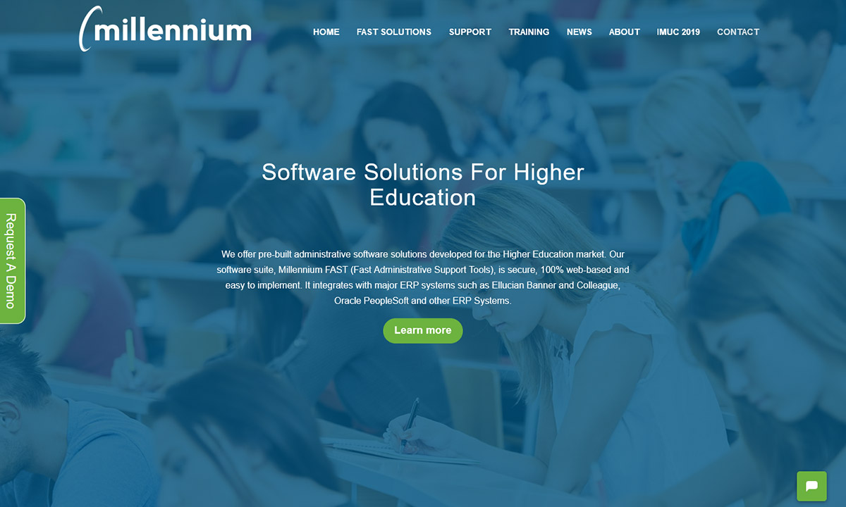
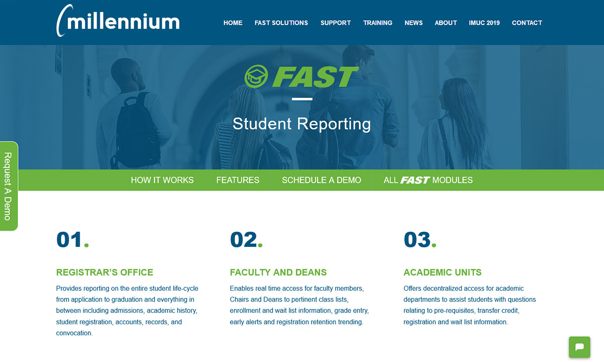
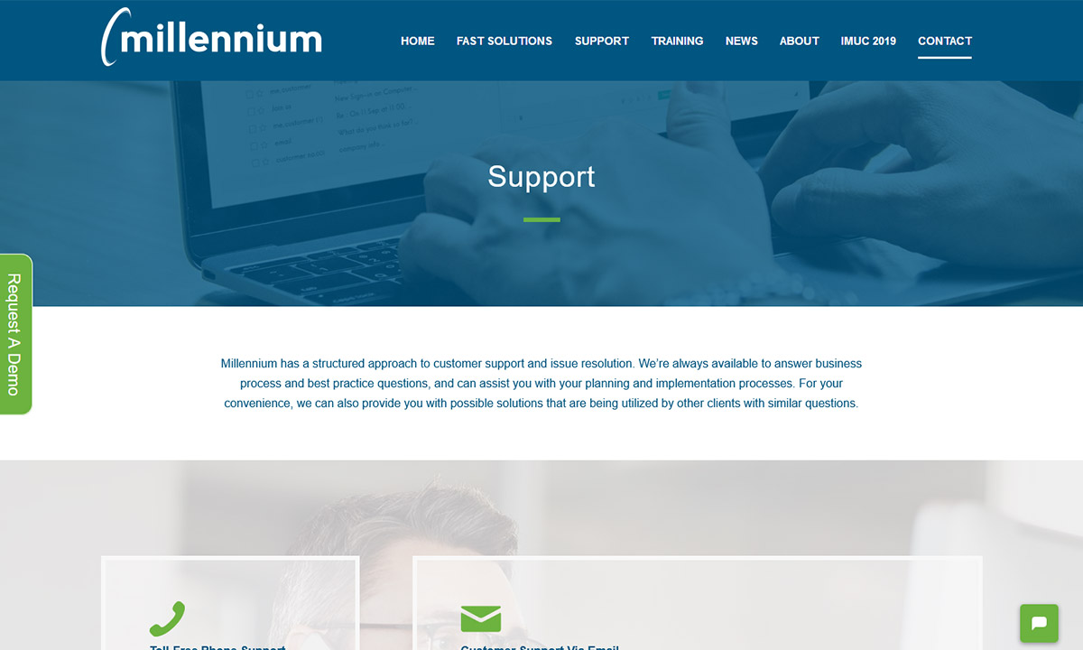
Our graphic designers started with a logo tweak to remove a tagline that no longer reflected Millennium’s business. From there, we used the existing colour palette but added rich imagery, a fun, dynamic layout and sophisticated animations and transitions. The new site is easy and intuitive to navigate but better reflects the refined look and feel of the educational institutions Millennium serves, as well as their own strengths in software and technology. In addition, time was spent ensuring the design was mobile responsive and the content easy to read on any device.
Functionality Retained and Improved
Millennium was pretty happy with the functionality on their old side, so their existing newsletter tool was saved and integrated into the new website. They opted for a new chat tool, but the platform was kept in WordPress to make it easy for Millennium to edit and maintain their own content. They frequently add articles to their blog and notes about upcoming software releases, so it was important to develop a content solution that was easy for them to update.
New calls to action (CTA) were included throughout the site. In particular, a prominent floating “request a demo” button on every page and a newsletter signup form in each page footer made is super easy for people to reach out. As their product is complicated, and a big investment, it’s important for the website to encourage people to contact them for more information while providing just enough detail to grab a potential customer’s interest.
Transitioning To A New Website
After the new design was finalized, we started working on moving over the content and making sure it was easy to find. Our digital marketing team developed a transition plan to make sure that all the content from the old site had the same page names or to redirect some of the older, but valuable content within the site to the new pages. While Millennium chose to streamline and eliminate some of their content, we wanted to be sure that their users were still able to find the old content, or better yet, something new but still relevant. Once that was done, it was time to ensure proper SEO information was applied throughout the site. And finally, Google Analytics tracking code was transferred over so they wouldn’t miss a single click recorded in their stats.
Successful Launch
We pushed through the last of the development and testing to ensure that the new site was live in advance of a marketing campaign for Millennium’s fall user conference. We think their existing customers and prospects alike will appreciate the ease of use and sophisticated look of the new site.


